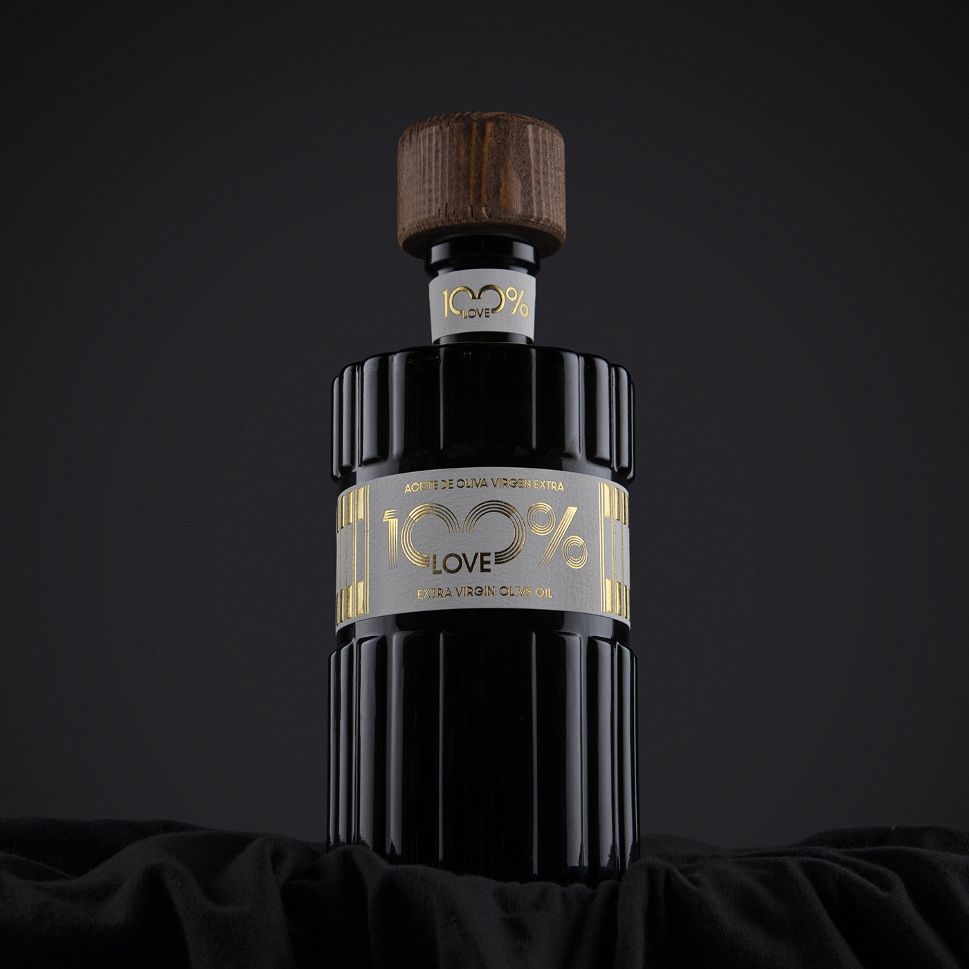
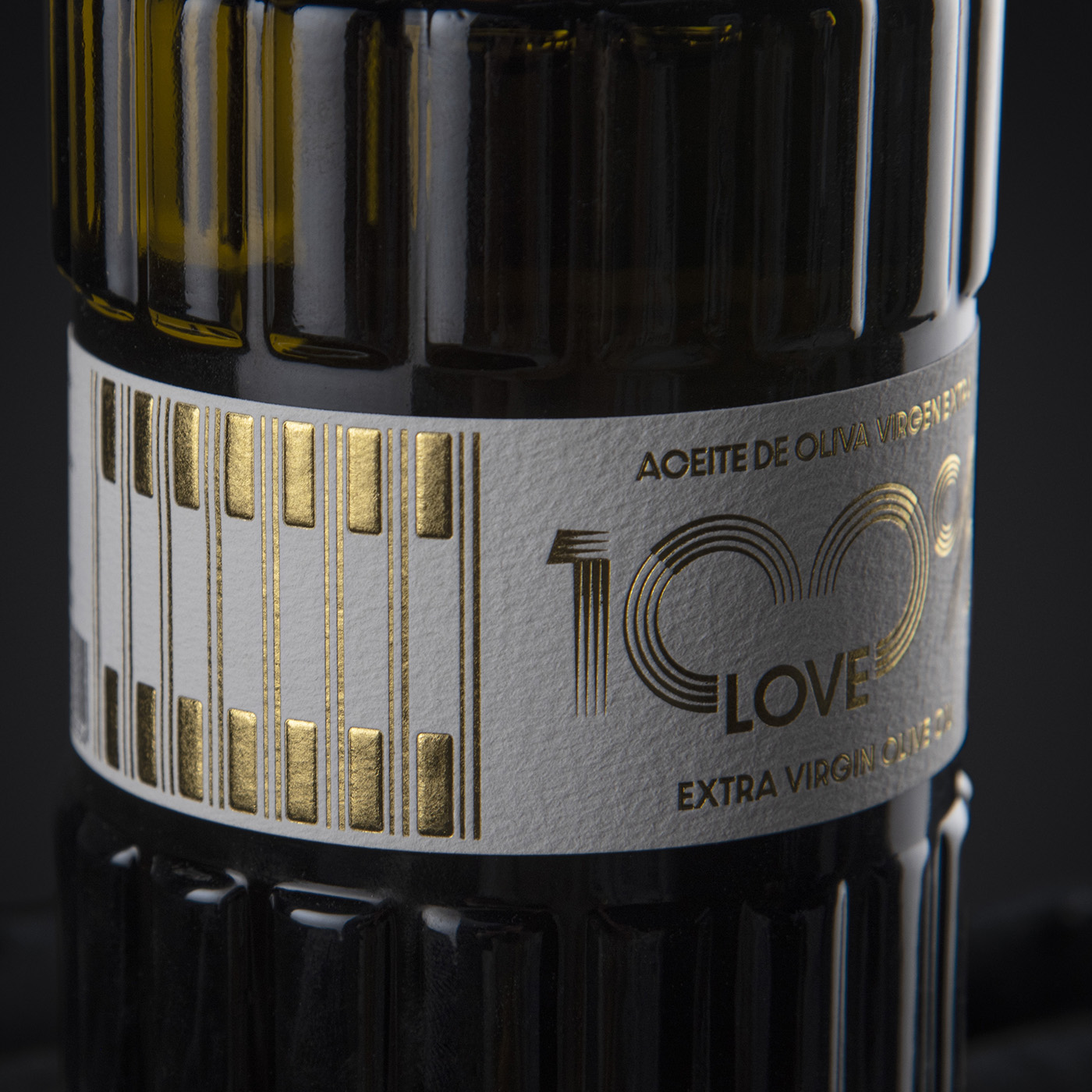
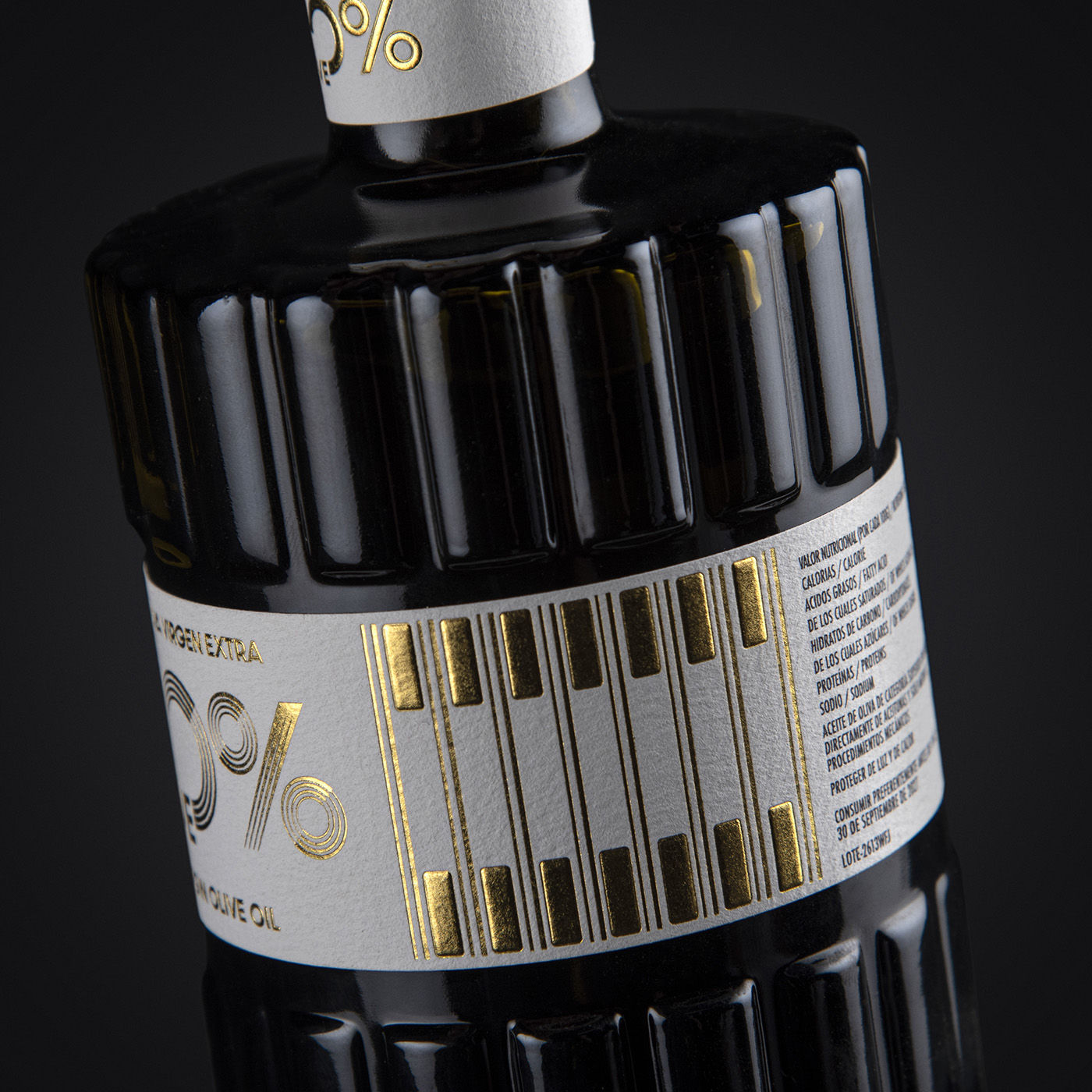
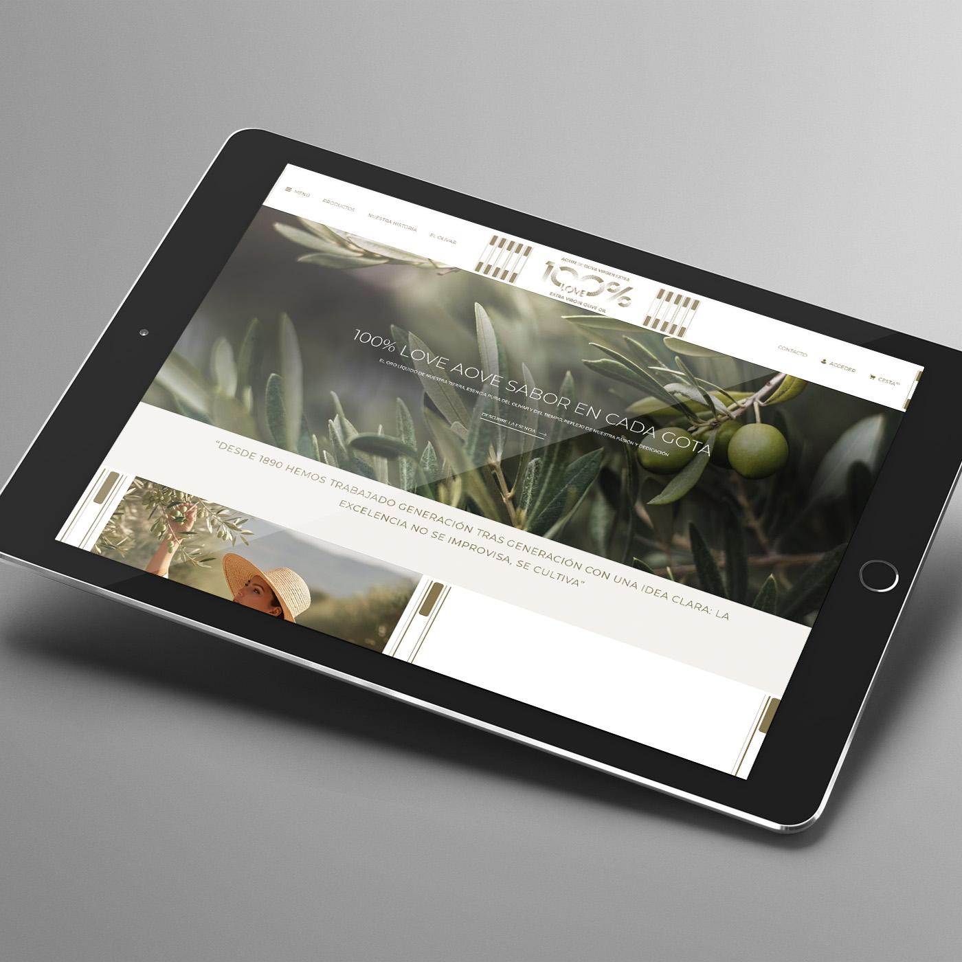
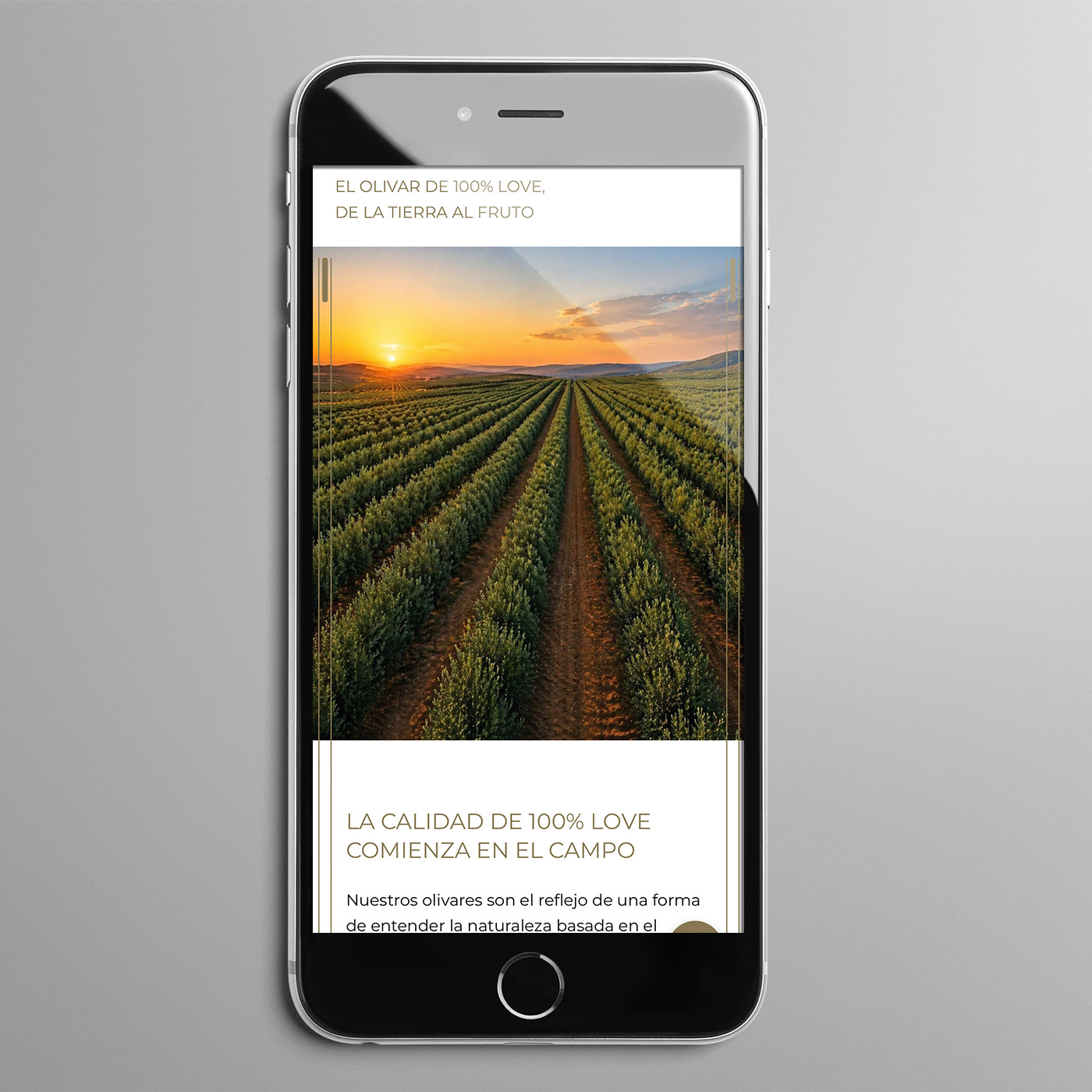
Diseño de branding y packaging para la marca de aceite 100% LOVE. El logo forma un corazón con líneas, principal elemento en toda la imagen de marca, desde la botella hasta la etiqueta impresa con stamping relieve para que se adapte mejor a la forma de la botella. El tapón está hecho a mano uno a uno con madera de olivo que le aporta contundencia y elegancia al mismo tiempo. La web sigue la estética elegante y premium de la marca y es responsive para adaptarse a los diferentes dispositivos móviles.
Branding and packaging design for the oil brand 100% LOVE. The logo—a heart formed by lines—serves as the central element of the brand’s visual identity, appearing on everything from the bottle itself to the label, which features embossed foil stamping designed to conform to the bottle’s shape. Each cap is individually handcrafted from olive wood, lending the product a sense of both substance and elegance. The website follows the brand's elegant and premium aesthetic and is responsive to adapt to different mobile devices.