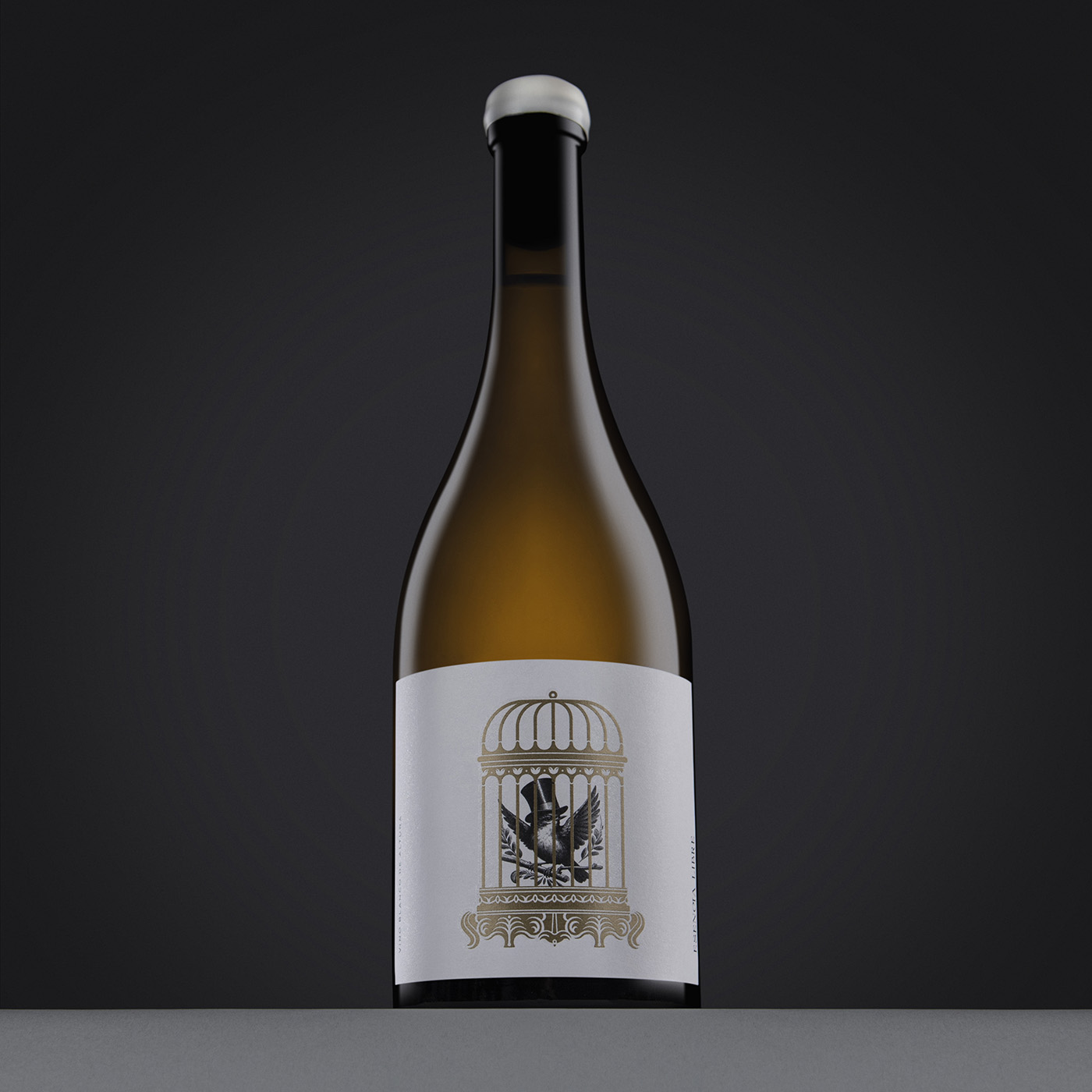
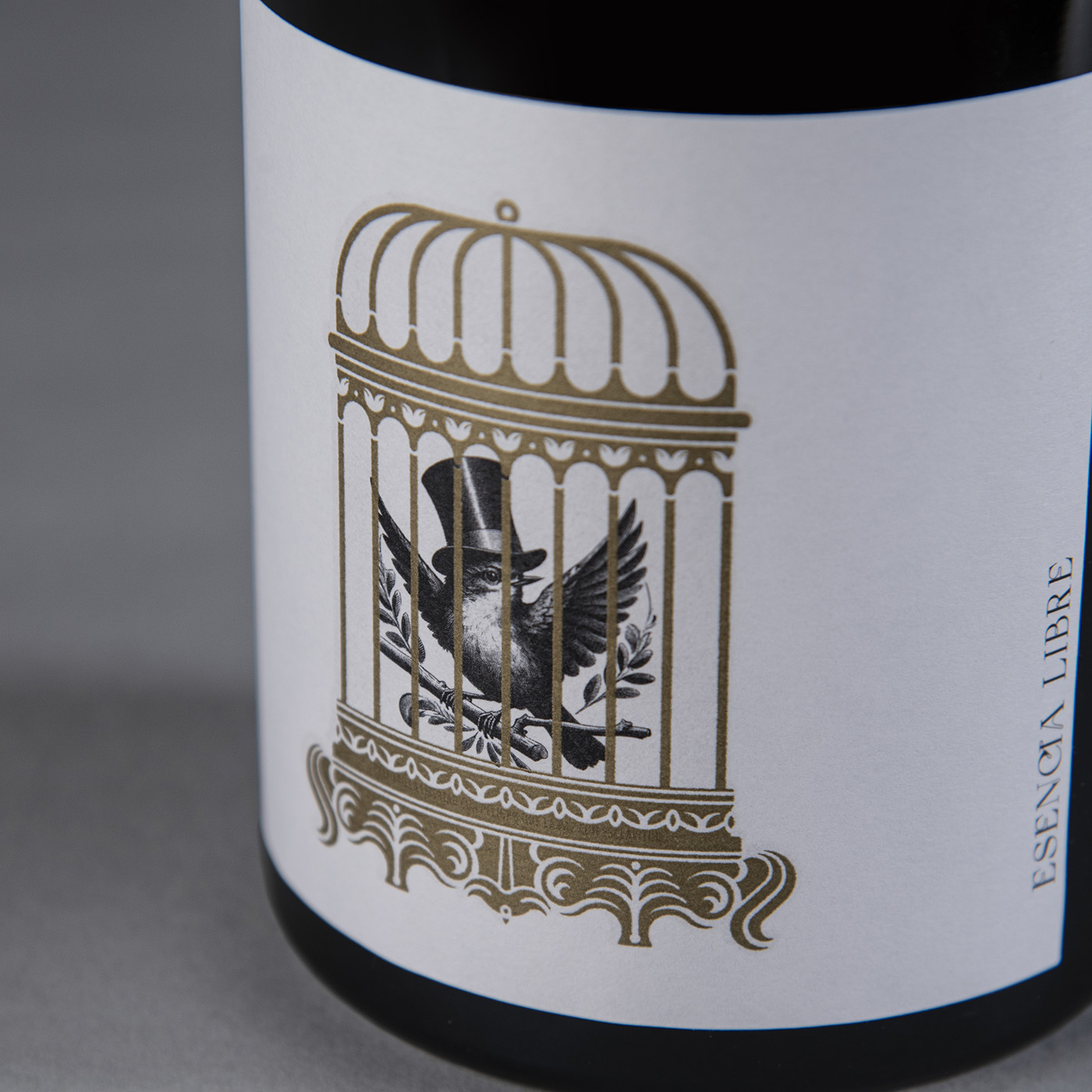
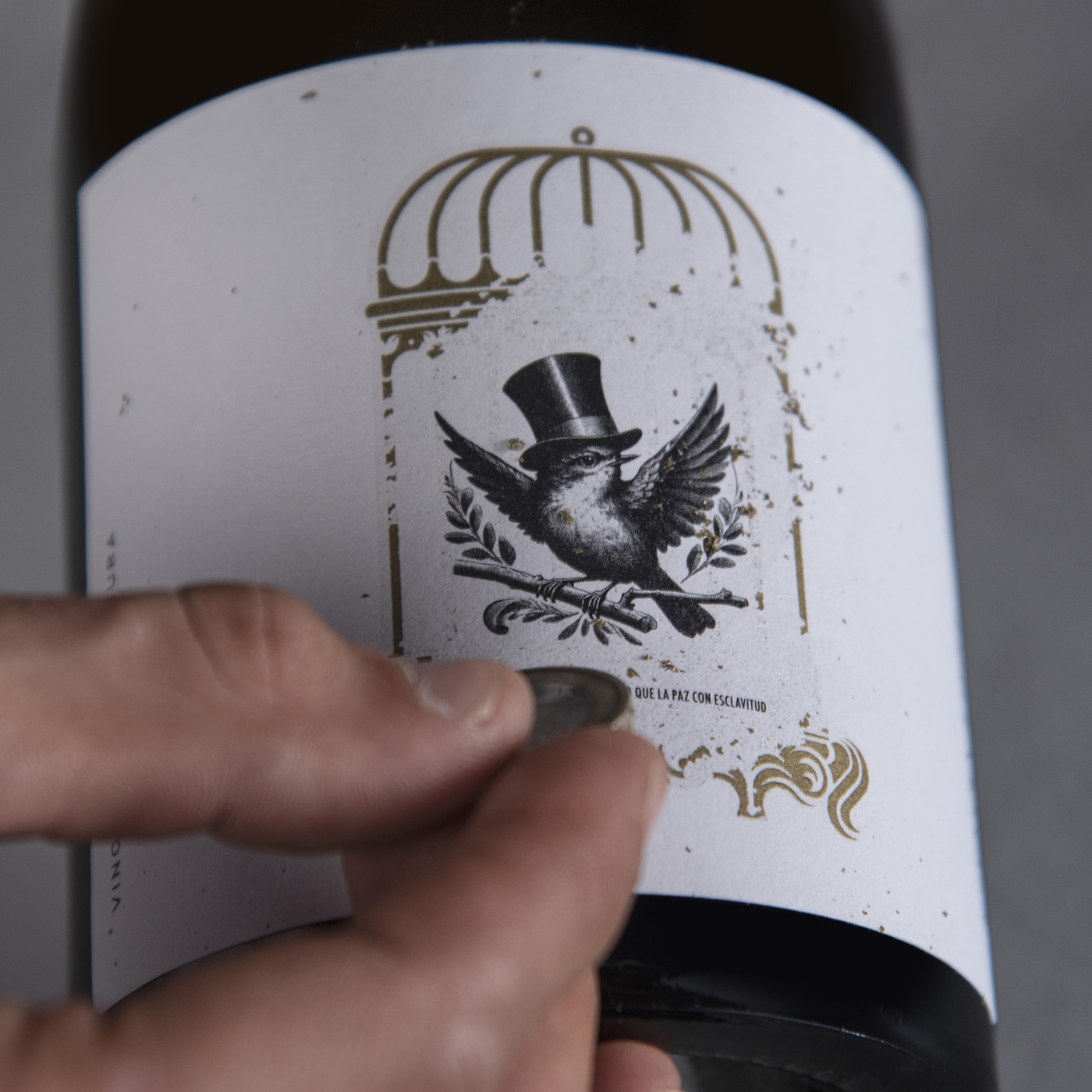
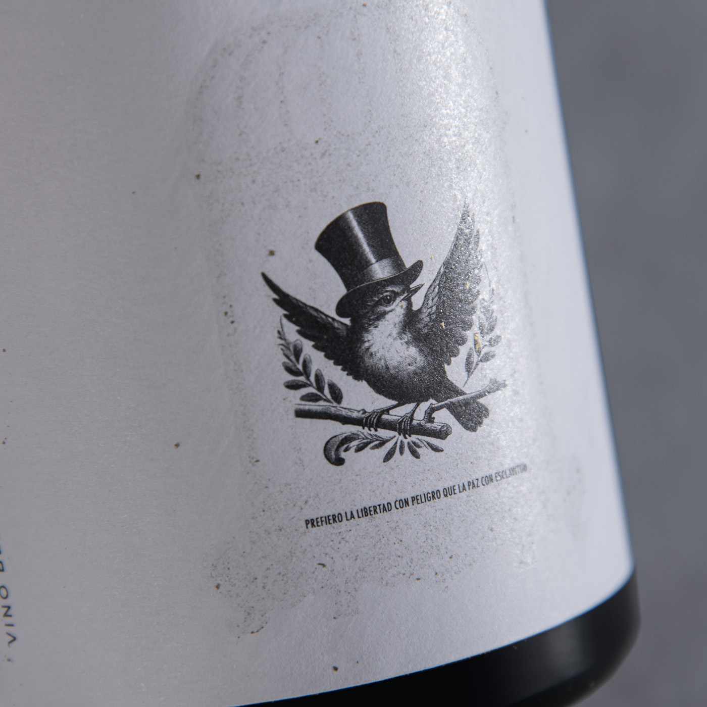
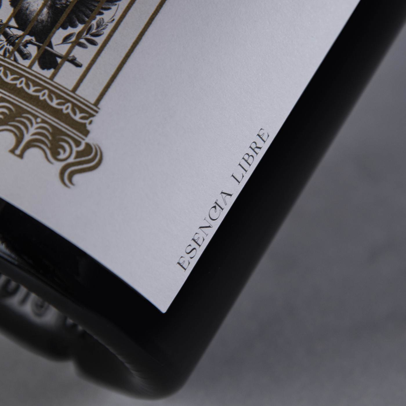
Diseño de packaging para el vino top de Bodega Valderueda. Recibe su nombre por la manera de elaborar de la bodega, sin seguir unas reglas establecidas y con total libertad. El concepto lo basamos en conseguir la libertad como la han conseguido ellos. La parte frontal de la etiqueta tiene un pequeño gorrión, pájaro libre por excelencia, enjaulado en una jaula de oro. La particularidad de este packaging es que si rascas la jaula, liberas al gorrión haciendo así una bonita metáfora a la vez que utilizas el packaging para interactuar con el consumidor.
Packaging design for the top wine of Bodega Valderueda. The wine’s name reflects the winery’s production philosophy: a process free from established rules, allowing for complete creative liberty. Our concept centers on the pursuit of this same freedom. The front of the label features a small sparrow—the quintessential symbol of a free bird—trapped inside a golden cage. A unique aspect of this design is that the cage can be scratched away, effectively setting the sparrow free; this creates a beautiful metaphor while simultaneously using the packaging as a tool for consumer interaction.